

Hi! I want to show you my project is a logo design for DreamSpace online sport and military clothing store. You can see how the logo idea evolved during the work process. Check out my project below.

Task
I'm tasked with creating a logo for a startup, an online clothing store specializing in sport and military apparel. The client has expressed a preference for purple and black colors. The project's concept revolves around portraying the cosmos with its infinite facets—whether it be a planet or something reminiscent of the vastness of space. The client has given me creative freedom, and the target audience is individuals aged 16 to 36.
"I've had a fascination with the cosmos since childhood. As an art school student, I often painted cosmic compositions featuring planets, stars, cosmic machines, fantastic plants, and animals. As I delved into sci-fi books later on, my interest only grew stronger. I appreciate the cosmos for its versatility and unique moods, which makes this project particularly meaningful to me. However, as a designer, I need to consider various practical aspects such as the company's activities, products, target audience, and more."
We discussed project details and I created 4 Mood Boards to work with.


Mood board #1 - Sport & Cosmos
The mood board comprises a blend of sportswear and cosmic motifs, featuring diagonal lines and repeated stripes in purple and black. The use of non-straight lines imparts a futuristic look to the clothing. Many elements on the clothes are built upon simple geometric forms, resembling cosmic patterns. It's like a fusion of cosmic and sporty aesthetics, isn't it?
Mood Board #2 - Purple Sport
This mood board emphasizes purple sportswear, with additional black and white elements. As you can see, the focus is on the product (clothes), while the cosmic theme is expressed primarily through colors.


Mood Board #3 - Military Cosmos
The mood board features a combination of sport and military clothing. The key elements include confident forms, utilizing broad elements with distinct meanings, and a network composed of dots, imparting a sense of texture or sponginess.
Mood Board #4 - Bold Sport
The incorporation of bold sportswear with wide lines has contributed to building a confident first impression and has made all elements easily memorable. Notice the use of white and black colors for the clothing elements.
"I defined 4 directions for inspiration. Was this amount enough to meet the Client's vision? I didn't know. I should tested all directions and then analysed Client's feedback."
I drew several sketches and created logotypes right in Illustrator to show them to the Client.

Logo #1 - Rocket (Mood Board #1 inspired)
The key idea is to incorporate a flying rocket as part of the logo. The font is bold and has a sporty appearance, achieved by using simple solid shapes that blend with thin lines. Drawing inspiration from the letters 'A,' 'C,' and 'E' in 'space,' I envisioned them as the cosmic rocket. I simply needed to try different compositions to determine whether it worked or not.

Logo #2 - Space (Mood Board #1 inspired)
This logo captures the enigmatic essence of space. The deep black color of the cosmos naturally draws people's attention, symbolizing infinite space without boundaries. Using negative space proves to be a clever idea to depict the best features of the cosmos in the logotype. While the logo appears flat due to the use of solid colors, a closer look at the word 'space' reveals that the letters are arranged sequentially.

Logo #3 - Sport button on spaceship (Mood Board #2 inspired)
As Mood Board #2 focuses on clothing, I opted not to include specific cosmic attributes in it. Instead, I aimed for a bold, easily readable, and memorable font—something that could be associated with sport. After searching, I found a font that embodied all these characteristics and more. I made slight modifications to the font to create a solid appearance, resulting in the logo resembling a button from a spaceship. It's worth noting that I deliberately avoided adding any intricate details.

Logo #4 - Sporty Aesthetic (Mood Board #2 inspired)
Let's explore the simple and repetitive shapes that compose the sporty aesthetic of the logotype. I utilized white as an accent color and chose 'DreamSpace' as the shop's name. Purple was introduced to infuse cosmic depth into the logotype, and lastly, black serves as the background color.

Logo #5 - Sport Cosmos (Mood Board #3 inspired)
I incorporated a volumetric graphic element to depict the depth of space, featuring a grid inspired by shoelaces, where each element is connected to another.

Logo #6 - Moving Planet (Mood Board #4 inspired)
I utilized negative space to create a logo consisting of two words connected by a graphic element representing a moving planet. The motion of the planet is depicted using the letter 'S.' The connection between the two words is highlighted by the rings of the planet. Additionally, to enhance the dynamic composition, I made the background more dynamic by narrowing its sides.
"I've created various logotypes, but were they suitable for the client's use on the website? I need to test them first."
I found mockups and created homepage designs for the logotypes.


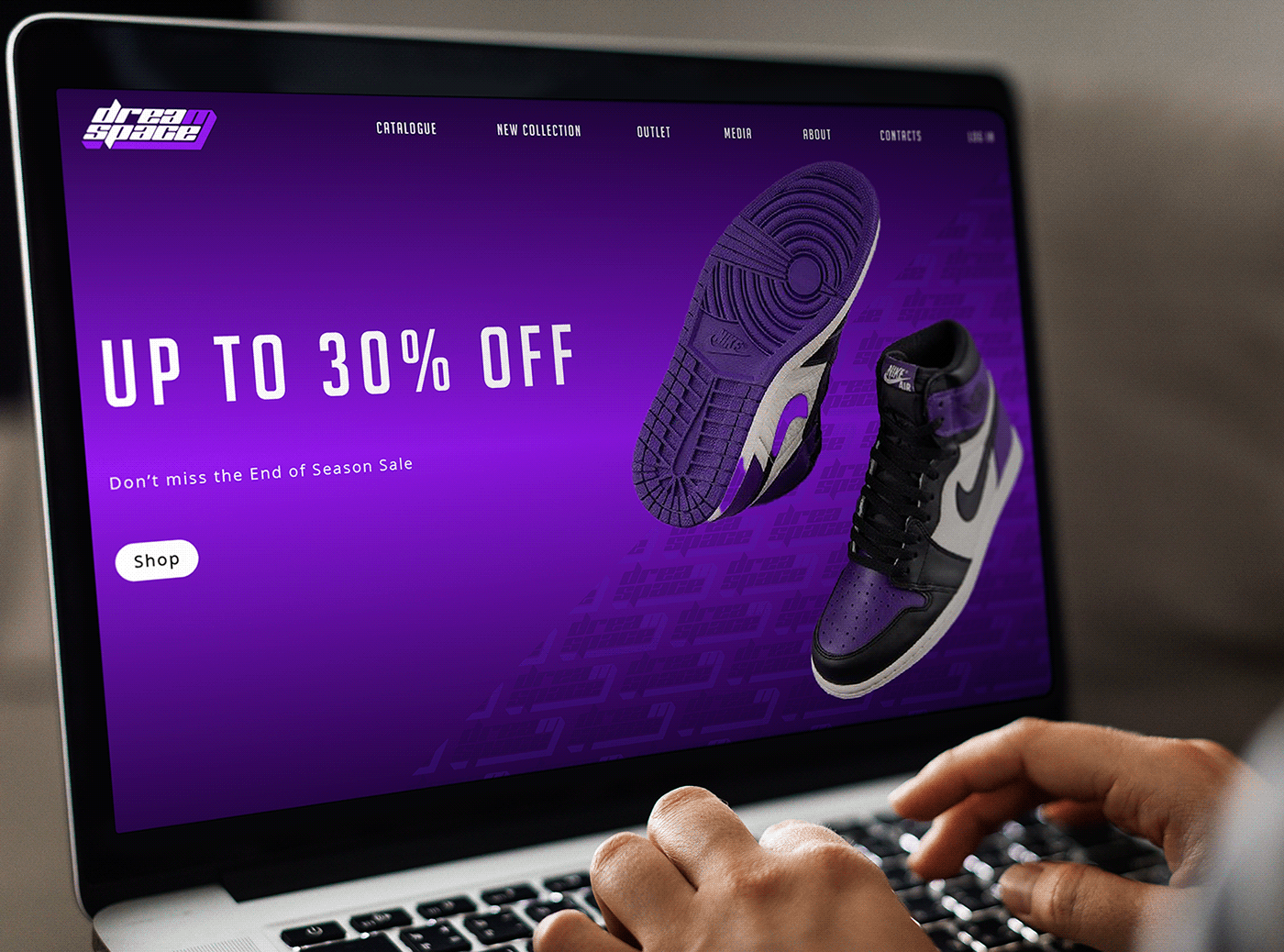
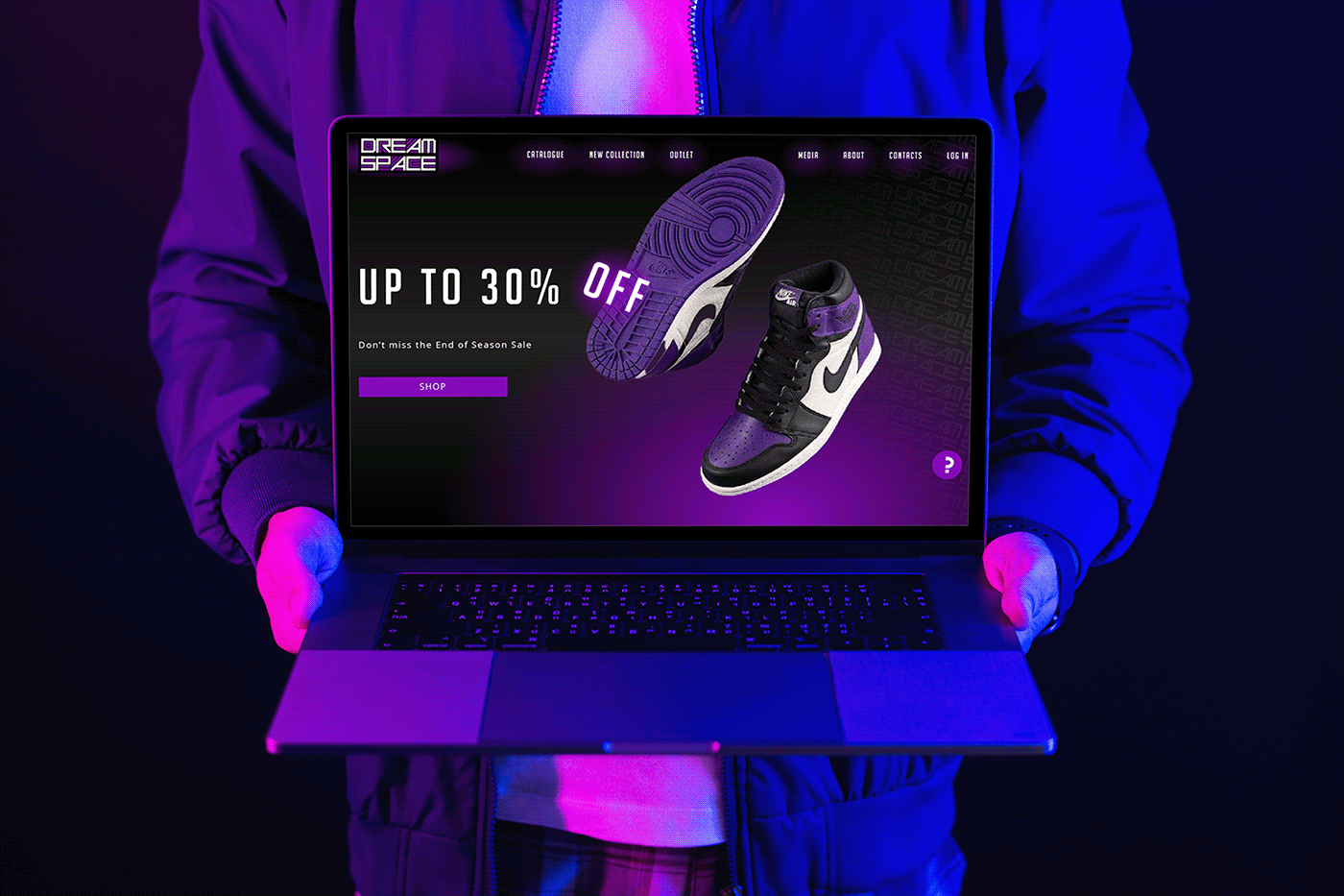
Homepage designs
I chose to view the logos from the perspective of a user on the client's website. Since the actual website was in the development stage and I didn't have a visual example, I crafted several homepage designs to incorporate the logos. Initially considering a unified design, I realized each logo had its own unique visual identity, prompting me to create multiple pages tailored to each logo. To reinforce the logo identity, I developed patterns and seamlessly integrated them into the designs. For the last logo, I utilized the graphic element of the planet as the 'Mega Sale' button.
Let's see the homepages into the mockups.


Revision
The Client chose Logo #3 as the best logotype for the DreamSpace online sport and military clothing store.
Feel free to revisit the project once more by checking out the Instagram carousel post design I added to my Instagram.


Client's Testimonial
"Done quickly and qualitatively. According to the client's requirements!" (translated)
"As we had established communication, the logo was created within three days. This timeframe encompassed all stages of the creative process, from Researching to Sending materials. I consider this a positive outcome because I selected the right direction and crafted a logo that the client liked, requiring no further changes. I strongly believe that effective collaboration relies on good communication. I appreciate the client for their prompt responses, clear answers, willingness to share all necessary information, and open-mindedness. Wishing success to the DreamSpace startup!"
What's next?
After we concluded our collaboration, I assisted the client in selecting the appropriate file format for the logo to use on the website. The chosen format ensures a smaller size and nice scalability.
Thank you for watching!
You've already read the cosmic story about creating the logo for DreamSpace, the online sport and military clothing store. I hope you opened the project because, like me, you appreciate sportswear, design, and the cosmos. Am I right? Feel free to share your thoughts in the comments; I would appreciate hearing your opinion on the project. Thanks a lot!
Best wishes,
Kateryna P.
Graphic Designer
at Our Creativity Planet
from Kharkiv region


